Today, were going to be going over the adjustment layer, gradient maps. If you've never used gradient maps before, or you simply don't know what they do, they basically manipulate the color scheme of your image. Proper use of gradient maps can render very nice results, with very limited knowledge required. But, I'll delve into that knowledge later into the tutorial, so let's begin.
1. We need to be able to locate gradient maps first of all, so we'll begin there. There are quite a few different places where you can find gradient maps, I'm going to show you two places to find them.
First location: On the bottom of the layers tab (Default location of the layers tab is in the bottom left-hand corner.), there is a row of functions for quick layer editing. In the very middle, there is a circle filled half black and half white, separated with a diagonal line. When you click on this icon, you will be shown a menu, from there you can distinguish gradient maps from the list of adjustment layers. Clarified below:
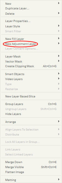
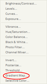
Second location: The second place you can find gradient maps takes a little bit longer to get to in my opinion, but hell, what do I know, some people may prefer to get to it this way. In the header of Photoshop, you will see the 'Layer' tab, inbetween 'Image', and 'Select'. Click once and you should see a drop down menu, in which you can choose new adjustment layer, and then gradient map (Layer>New Adjustment Layer> Gradient Map). Clarified below:


2. Okay, now that we have identified how to find gradient maps, it's now time to learn how to use them. You should see a window like this, somewhere on your Photoshop palette:
Gradient map selection base
3. From this base, you can go with the default B&W gradient, or you can click on the black arrow (Pointing downwards) to get a larger selection of gradients. I selected the violet and orange gradient, and I will clarify the effects of it, starting with the 3rd image below:
Violet and orange gradient
Original image, without gradient (Stock from SigResource)
Image with violet and orange gradient
4. Well, as you can see, this isn't exactly a pretty sight. We got the violet and orange color scheme now, but it's way too overpowering. This is the part where layer styles and opacity adjustments come into play. By simply changing the gradient map layer style to color dodge, and reducing to the opacity to 38%, I got a nice toned contrast. Clarified below:
Image with updated layer styles and opacity
(Original image for comparison)
5. The last and most important step to gradient maps, is to EXPERIMENT!! I don't know if I can stress this enough! I strongly encourage you to try out all kinds of different colored gradient maps in coordination with all sorts of different layer styles. There is such a variety of results that can be created from simply experimenting.
So that concludes this tutorial, I hope that it was informative and helpful, even if only a little. I can also add that to get more unique results, you need to add more gradient maps to your image. I use gradient maps in almost every piece of art I make, and the amount of them can vary from 20 to 2. In the end it's all personal preference, as long as YOU like your outcome, that's what's important.
Below I'm going to give three more examples of the stock I used in the tutorial, manipulated with gradient maps only.
And before I finish this post, as I promised before, I'm going to leave a link to my home site SigResource. Again, this site is full of thousands of resources (Where I acquired this stock, infact.), tutorials, and incredibly helpful members. Feel free to sign up if you need criticism on your artwork, resources for your work, or just a friendly community to be with.
FIN

